

Carousel
Carousel is a content slider featuring various customization options.
Import #
import { CarouselModule } from '@openng/optimus-ui/carousel';Basic #
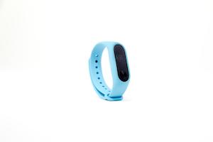
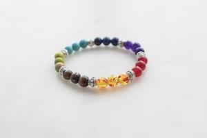
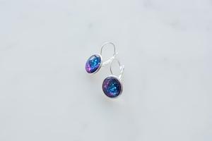
Carousel requires a collection of items as its value along with a template to render each item.






Circular #
When autoplayInterval is defined in milliseconds, items are scrolled automatically. In addition, for infinite scrolling circular property needs to be added which is enabled automatically in auto play mode.
Responsive #
Carousel supports specific configuration per screen size with the responsiveOptions property that takes an array of objects where each object defines the max-width breakpoint, numVisible for the number of items items per page and numScroll for number of items to scroll. When responsiveOptions is defined, the numScroll and numVisible properties of the Carousel are used as default when there is breakpoint that applies.

Vertical #
To create a vertical Carousel, orientation needs to be set to vertical along with a verticalViewPortHeight.
Accessibility #
Screen Reader
Carousel uses region role and since any attribute is passed to the main container element, attributes such as aria-label and aria-roledescription can be used as well. The slides container has aria-live attribute set as "polite" if carousel is not in autoplay mode, otherwise "off" would be the value in autoplay.
A slide has a group role with an aria-label that refers to the aria.slideNumber property of the locale API. Similarly aria.slide is used as the aria-roledescription of the item. Inactive slides are hidden from the readers with aria-hidden.
Next and Previous navigators are button elements with aria-label attributes referring to the aria.nextPageLabel and aria.firstPageLabel properties of the locale API by default respectively, you may still use your own aria roles and attributes as any valid attribute is passed to the button elements implicitly by using nextButtonProps and prevButtonProps.
Quick navigation elements are button elements with an aria-label attribute referring to the aria.pageLabel of the locale API. Current page is marked with aria-current.
Next/Prev Keyboard Support
| Key | Function |
|---|---|
| tab | Moves focus through interactive elements in the carousel. |
| enter | Activates navigation. |
| space | Activates navigation. |
Quick Navigation Keyboard Support
| Key | Function |
|---|---|
| tab | Moves focus through the active slide link. |
| enter | Activates the focused slide link. |
| space | Activates the focused slide link. |
| right arrow | Moves focus to the next slide link. |
| left arrow | Moves focus to the previous slide link. |
| home | Moves focus to the first slide link. |
| end | Moves focus to the last slide link. |