Avatar
Avatar represents people using icons, labels and images.
Import #
import { AvatarModule } from '@openng/optimus-ui/avatar';
import { AvatarGroupModule } from '@openng/optimus-ui/avatargroup';
Label #
A letter Avatar is defined with the label property.
Label
Circle
Badge
Icon #
A font icon is displayed as an Avatar with the icon property.
Icon
Circle
Badge
Image #
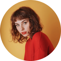
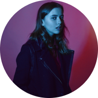
Use the image property to display an image as an Avatar.
Image

Badge

Gravatar

AvatarGroup #
Grouping is available by wrapping multiple Avatar components inside an AvatarGroup.


Size #
size property defines the size of the Avatar with large and xlarge as possible values.
Shape #
Avatar comes in two different styles specified with the shape property, square is the default and circle is the alternative.
A badge can be added to an Avatar with the Badge directive.